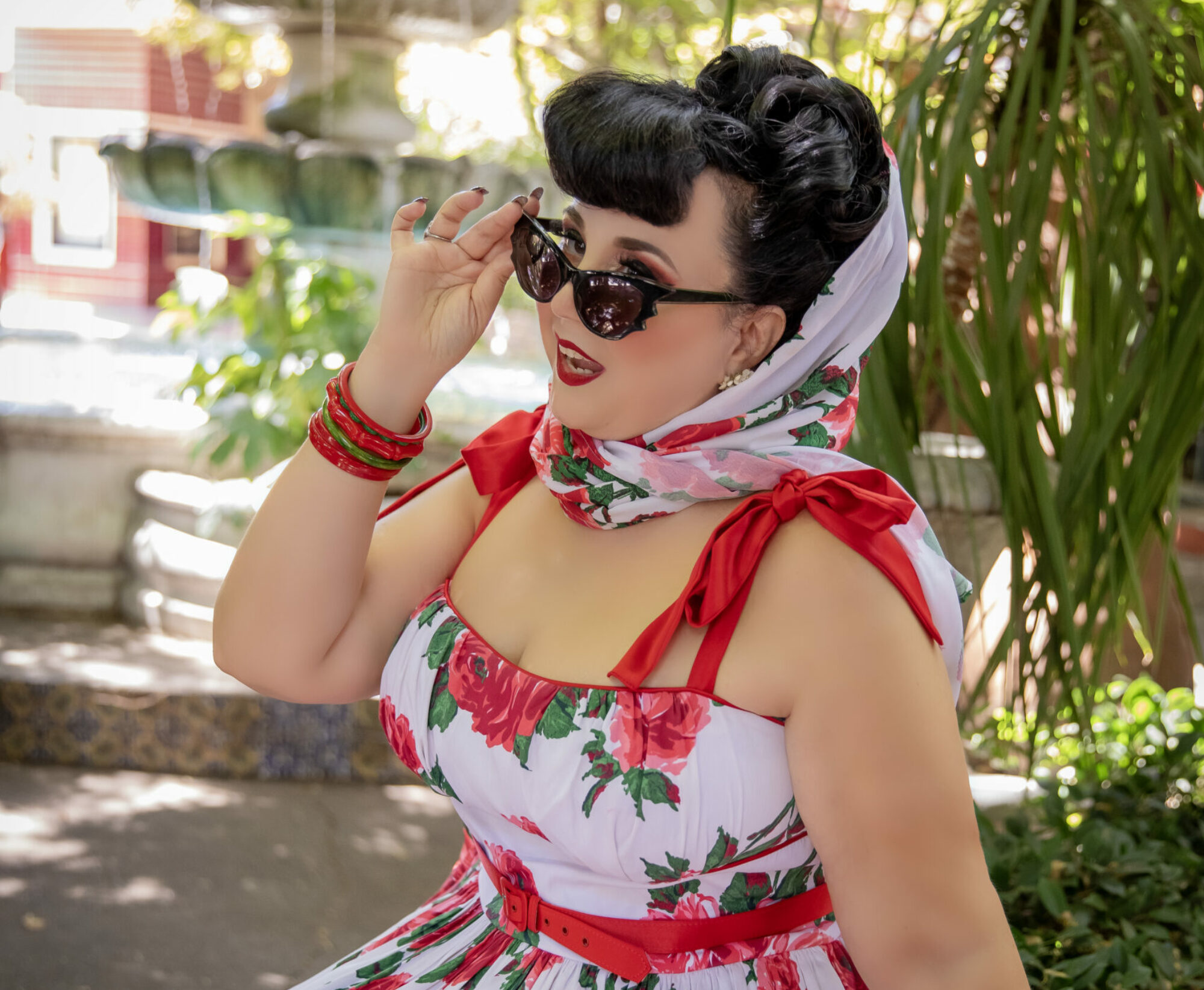
As a person whose style is by definition not very trendy, it seems silly for me to care about Pantone’s seasonal color palettes. If you think about it, though, it does make sense. Even if I wear primarily vintage and vintage reproduction clothing, current color trends are going to affect any new accessories and repro-used fabrics I’ll be considering. So, why not do a little planning ahead? Forwarned is forearmed!

If you joined the Emerald bandwagon last spring, rejoice! Pantone’s 2013 color of the year is back and surrounded by a slightly cooler, darker version of last season’s palette and a virtual re-run of last fall’s, with a few of the mid-light, warm tones (Light Chartreuse, Honey Gold, and Rose Smoke) replaced by a crisp, attractive light green called Linden Green. There’s also Samba, a cool brick red that says “dark seasons” without sacrificing brilliance. There should always be a “lipstick” color in a fall palette!
Vivacious – a vibrant berry – and Acai – a cool purple – add to the fun without heading into magenta/plum/aubergine territory. These would be pretty accessory colors to wear with my many black dresses!
